SPACE BETWEEN SPACE WITHIN
MOTOI YAMAMOTO SOLO EXHIBITION 2016
2016
Exhibition Branding
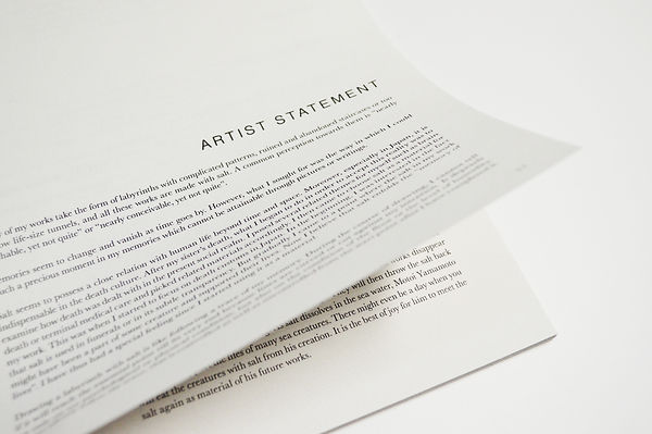
Motoi Yamamoto is a Japanese artist who uses salt as a medium to create temporary, and intricate large scale installations. Motoi Yamamoto forged a connection with the element while mourning for the death of his sister at twenty-four from brain cancer. He started to create art out of salt in an effort to trace back his memories. Just as memories are unfixed and transient, his installations are equally unstable and temporary. His works radiate intense beauty and tranquility, but also convey something ineffable, yet endless.
In this project, we were asked to design a brand identity for the artist's exhibition.
DESIGN CONCEPT
When one first looks at Motoi Yamamoto’s salt installation, there is some sort of light and temporary feeling lingering within the installation space. In order to fully understand his works, one have to be in the space in order to fully experience the vast amount of feelings contained within the works of the artist. The only material used was white salt. The whiteness of the tiny transparent salt particles is what gives the works their transient, peaceful, fleeting and airy vibes.
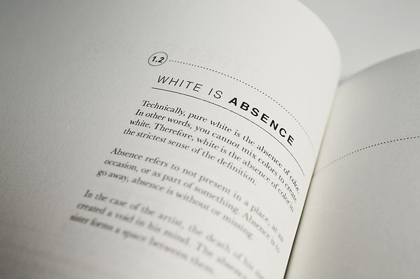
When tiny small crystal-like salt particles are placed together in large amounts, it becomes white in colour. Motoi Yamamoto draws the patterns using white colour salt in a given space. White is a colour that portrays the idea of space. White space, many times referred to as negative space, is the portion of a page left unmarked, the portion that is left blank, with nothing.
Space is something that is very prominent in Motoi Yamamoto’s work. The concept of the exhibition revolves around the idea of Space. The concept of space then evolves into two forms; Space Between and Space Within. The word Within refers to something internal. It refers to something that is contain inside or indoor. It could be like memories in the mind, experiences or feelings in the heart. Within refers to a space that is enclosed. To be within something, it has to be surrounded by it. Whereas for the word Between, it is a connection between two points. Between usually expresses a reciprocal relationship of two person or two things, whether it is close and dense with less space in between or apart and distant with more space in between. Spaces between can reveal the level of secrecy and intimacy between two person or things. It could also be an intermediate space or time between two objects. The word between means combination of two things; between them.
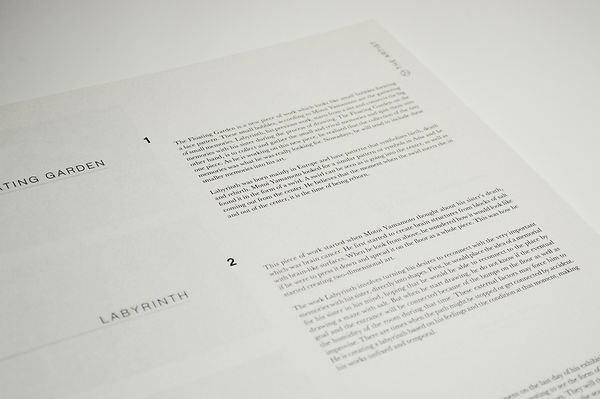
Motoi Yamamoto started creating these salt installation after his sister passed away suffering from brain cancer. After the death of his sister, there is both a physical and psychological space between them. A space between the living and the dead. As he works on his salt installation within a space of an enclosed room, he is also building a space; a space within his own mind. That space is an intimate space, which only he can access. As he slowly uses the salt to form a labyrinth like a passage way of connection. He is slowly tracing and following its path as he returns to his memory space, which gradually reveals the times he was with his late sister. His art is like a healing process for him, not to preserve the memories, but to touch and connect with a precious moment in his memories, which cannot be attained through pictures or writings. This connection helps to close up the space between him and his sister.

BRAND IDENTITY
The branding of the exhibition takes on three different variations based on 3 key words: Space, Memory and Labyrinth. All three variations were developed based on a common shape. A cube represents a three-dimensional space as well as the shape of a salt particle. From the shape of the cube, the design was further simplified into its outline which forms the shape of a hexagon.
The second design is created using cubes to form a three-dimensional maze. This represents a maze within a space just like memory within our mind. Motoi Yamamoto’s works are very much driven by the memories of him and his late sister.
The third design is a two-dimensional maze relating to the labyrinth of Motoi Yamamoto, within the shape of a hexagon.
FINAL DELIVERABLES
The final deliverable of this exhibition branding consists of posters, tickets, invitation card, crew tags, exhibition guide, a packaging design for the exhibition souvenir and a catalogue book which includes all the process and development of the entire exhibition branding.
EXHIBITION POSTERS


The design of these posters were based on the idea of the space between two things. By placing the two posters side-by-side, it forms a space between the graphics on the poster. The black and the white poster can be placed in alternate arrangement in a row similar to a banner. The black poster (Left) consists of the date, time and venue of the exhibition while the white poster (Right) consist of the information and concept of the exhibition.
EXHIBITION TICKETS


The different events of the exhibition have different set of tickets. They are represented by different graphics. All graphics are part of the brand identity. By looking at the graphics on the ticket, it is easy to differentiate which event it belongs to. The tickets are to be perforated at both ends by the crew members at the beginning and the end of the exhibition. Visitors are allowed to keep the centerpiece of the ticket as a card from the exhibition.
EXHIBITION INVITATION CARD


The invitation card for the exhibition takes on the brand identity in the shape of a hexagon, representing both space as well as a salt particle. It comes with an envelope which appears as a salt cube when sealed. In the invitation card, it consists of the important information about the opening night such as how to get to the museum as well as the activities and events for the night. On the left side of the invitation is a simple and fun activity for the recipients to solve the labyrinth puzzle upon receiving it.
EXHIBITION GUIDE
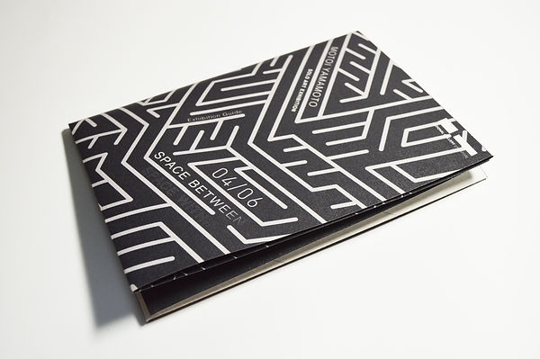


The exhibition guide consists of the background of the artist and the concept of the exhibition. It also has a list of artworks and a map to help visitors navigate in the gallery to the specific artwork location. Important gallery information is placed at the back of the exhibition guide. This exhibition guide is also an A2 size poster when unfolded entirely. Visitors can have a copy of it to guide them around during the exhibition and bring it back home as a poster from the exhibition.
EXHIBITION CREW TAGS


These tags are designed specifically for the exhibition. The tags have different graphics relating to the branding of the exhibition to differentiate the different roles of the crew members and staff.
EXHIBITION SOUVENIR PACKAGING


On the last day of the exhibition, there is an event called ‘Return to the Sea’ where the public are welcome to participate in the dismantling of the artist’s works. Each participant will be given a packaging, which consists of a glass bottle and a spoon for the them to collect the salt in the exhibition and bring it home. The packaging comes with a small card, which allows the public to write down their dearest memory after dismantling the salt installation. The public can deliver the salt back to water after the closing of the exhibition.
EXHIBITION CATALOGUE


The entire project was developed during the class of Visual Communication III at Nanyang Technological University, School of Art, Design and Media.
This is a non commercial project, for assignment practice purposes only.